An HTML Email is an email created with HTML and CSS, with formatting and semantic markup capabilities that are not available with plain text. HTML Emails can include images, buttons, blocks with colored backgrounds, and more.
There are restrictions, though, so you can’t create HTML Emails the way you design ordinary landing pages. For example, to enable your HTML Email to be displayed in all popular mail clients, you usually need to use tables instead of <div> elements.
Here’s what we’ll be creating in this tutorial:
Click on "Edit on Codepen" to see how it looks on the desktop.
Preparing your HTML document
Let’s start with preparing our HTML document. We’ll define the HTML document, add all the necessary <meta> tags, import fonts, and create an outer wrapper element.
Create an index.html file, then copy and paste this code:
<!DOCTYPE html PUBLIC "-//W3C//DTD XHTML 1.0 Transitional//EN" "https://www.w3.org/TR/xhtml1/DTD/xhtml1-transitional.dtd">
<html xmlns="http://www.w3.org/1999/xhtml">
<head>
<meta http-equiv="Content-Type" content="text/html; charset=utf-8" />
    <!--[if !mso]><!-->
        <meta http-equiv="X-UA-Compatible" content="IE=9; IE=8; IE=7; IE=EDGE" />
    <!--<![endif]-->
    <meta name="viewport" content="width=device-width, initial-scale=1.0">
    <title></title>
    <style>
        @import url(https://fonts.googleapis.com/css2?family=Lato&display=swap);
        <!-- Styles for all clients -->
        center {
            font-family: Lato, Verdana, sans-serif;
        }

        <!-- Styles for WebKit clients -->
        @media screen and (-webkit-min-device-pixel-ratio:0) {
            center {
                font-family: Lato, Verdana, sans-serif !important;
            }
        }
    </style>
    <!--[if (gte mso 9)|(IE)]>
    <style type="text/css">
        table {border-collapse: collapse;}
    </style>
    <![endif]-->
</head>
<body style="padding:0; margin:0 !important">
    <center style="width: 100%; table-layout: fixed;">
        <div style="max-width: 600px; margin: 0 auto;">
            <!-- Content goes here -->
        </div>
    </center>
</body>
</html>
!DOCTYPE html PUBLIC "-//W3C//DTD XHTML 1.0 Transitional//EN" is a DOCTYPE declaration that is used most often for HTML Emails. It allows loading HTML with limited quirks.
<meta http-equiv="Content-Type" content="text/html; charset=utf-8" /> gives support of all Unicode characters in our document.
<meta http-equiv="X-UA-Compatible" content="IE=9; IE=8; IE=7; IE=EDGE" /> is used to allow Windows Phone to display our mobile version correctly. This <meta> tag is inside a conditional comment that hides it from any “mso” (Microsoft Outlook) products to prevent a problem where Windows Live Mail will not display images when this tag is used.
<meta name="viewport" content="width=device-width, initial-scale=1.0"> gives the browser instructions on how to control the page’s dimensions and scaling. The width=device-width part sets the width of the page to follow the screen-width of the device (which will vary depending on the device). The initial-scale=1.0 part sets the initial zoom level when the page is first loaded by the browser.
Include <title></title> for valid XHTML. However, some native Android mail clients will display this title just before the preheader in the inbox preview, so it’s best to leave the title empty.
@import url(https://fonts.googleapis.com/css2?family=Lato&display=swap); is used to import the Lato font from Google Fonts. (You can import any other font you like.) Put fonts behind a WebKit conditional media query so that Outlook doesn’t mess them up:
<style>
    @import url(https://fonts.googleapis.com/css2?family=Lato&display=swap);

    /* Type styles for all clients */
    table {
        font-family: Lato, Verdana, sans-serif;
    }

    /* Type styles for WebKit clients */
    @media screen and (-webkit-min-device-pixel-ratio:0) {
        table {
            font-family: Lato, Verdana, sans-serif !important;
        }
    }
</style>
Later, you might need to include a font family, font size, and color for every <td>, or else you risk that the client overwrites your chosen styles. To be certain of applying bold, underline, italic, and strike-through styles, you might need to fallback to <strong>, <u>, <em>, and <del> syntax.
Next, between <!--[if (gte mso 9)|(IE)]> and <![endif]-->, we put conditional CSS rules for Outlook to force it to collapse borders on all tables and prevent unwanted gaps. This conditional expression targets all versions of Microsoft Outlook (mso) greater than or equal to Version 9 as well as versions of Outlook that use Internet Explorer.
Standard <style> tags can be included in HTML bodies, and Gmail also supports media queries. However, for greater safety, we’ll be using old-school Inline CSS. In other words, we’ll define CSS rules directly inside HTML tags. You can also use CSS inliners, e.g. Foundation for Email’s Responsive Email Inliner or Responsive CSS Inliner.
Note that the <body> tag may be stripped in webmail clients. So we’ll also use the <center> tag to center our content and to apply global CSS styles. The table-layout: fixed rule on the <center> element will ensure our centered content will actually be centered in Yahoo Mail. Don’t forget to set the margins and padding at zero value on the body.
Inside the <center> element, we’ll nest a <div> element that will be used for earlier versions of WebKit-powered mail clients (Apple Mail 6 and below, as well as Outlook 2011). We’re setting a max-width of 600 px wide and giving it a margin of 0 auto so that it will be centered in Yahoo Mail. 600 px is the recommended maximum width for HTML Emails.
Design your newsletter with a width of around 550 to 600 px and make sure the important information is within the top 300 to 500 px. This is the size of an average “preview pane” in most desktop email clients.
Container
In this tutorial, we’ll use a two-column layout inspired by Nicole Merlin’s responsive email layout. Essentially, it boils down to this. We create a parent “ghost” table which has a width value of 100% and a max-width of our maximum defined email width defined in pixels (600 px). Inside that table, we’ll create additional table elements or containers, each with the same 100% width and an appropriate max width (2 equal columns, each with a max-width value of 280 px).
Now we’ll be working with the inside of this element:
<div>
    <!-- Content goes here -->
</div>
The best practice and a safer solution are to stick to tables instead of <div> elements when designing HTML Emails. But you also can use semantic HTML tags, such as <p> and <h1>, where applicable.
Inside our <div> element, add a <table> tag that will define an HTML table:
<div>
    <table>
        <!-- Content goes here -->
    </table>
</div>
Add role="presentation" to each table so that it’s clear the table is being used for layout. When using tables, don’t forget to add border="0" cellpadding="0" cellspacing="0" to all <table> tags.
We want our outer table to be 100% wide on small screens but a maximum of 600 px on larger screens. So we’re going to set its width to 100% and give it a max-width of 600 px.
However, since Outlook doesn’t support the max-width property, we also need to create special Outlook-only tables with explicit pixel widths (e.g. width="600").
<!--[if (gte mso 9)|(IE)]>
<table role="presentation" cellspacing="0" cellpadding="0" border="0" width="600" align="center">
    <tr>
        <td>
<![endif]-->
<table role="presentation" cellspacing="0" cellpadding="0" border="0" align="center" style="Margin: 0 auto; padding: 0; width: 100%; max-width: 600px; font-family: Lato, Verdana, sans-serif;">
    <!-- Content goes here -->
</table>
<!--[if (gte mso 9)|(IE)]>
        </td>
    </tr>
</table>
<![endif]-->
Some email clients will ignore a background on the <body> tag, or one that’s set in your style sheet. Therefore, set a background color (if you need any) on a container table or a wrapper element.
Our HTML Email will be contained inside this element:
<table role="presentation" cellspacing="0" cellpadding="0" border="0" align="center" style="Margin: 0 auto; padding: 0; width: 100%; max-width: 600px; font-family: Lato, Verdana, sans-serif;">
    <!-- Content goes here -->
</table>
Here’s the general structure of what we’ll be building next:
<table role="presentation" cellspacing="0" cellpadding="0" border="0" align="center" style="Margin: 0 auto; padding: 0; width: 100%; max-width: 600px; font-family: Lato, Verdana, sans-serif;">
    <tr>
        <td>
            <!-- Image banner goes here -->
        </td>
    </tr>
    <tr>
        <td>
            <!-- Some text goes here -->
        </td>
    </tr>
    <tr>
        <td>
            <!-- Main content goes here -->
        </td>
    </tr>
    <tr>
        <td>
            <!-- Button goes here -->
        </td>
    </tr>
    <tr>
        <td>
            <!-- Footer with social buttons goes here -->
        </td>
    </tr>
</table>
<tr> tags define each table row, and <td> tags define each table cell. The <td> elements are the data containers of the table. They can contain all sorts of HTML elements: text, images, lists, other tables, etc.
Preheader Text
But first, we’ll add a preheader text.
Some mail clients grab the first bit of text they find in your email’s body and display it next to or under the subject line of an email. These clients include AOL, Apple Mail, Gmail, iOS, and Outlook 2013. Here’s an example of a preheader text:

“Take a look at this week’s best articles!” is the preheader text, which is a little snippet, usually 50–100 characters, that can entice subscribers to open the email. The preheader text is usually a hidden element in the body’s content that appears first.
You can insert the preheader text right after the opening <body> tag. You can hide this text like this:
<body>
    <span style="color: transparent; display: none !important; height: 0; max-height: 0; max-width: 0; opacity: 0; overflow: hidden; mso-hide: all; visibility: hidden; width: 0;">Take a look at this week’s best articles!</span>
    ...
</body>
You can use Austin Woodall’s preheader tool on CodePen to preview your email subjects and preheaders.
Image Banner
Now let’s create a header with an image banner.

Note that not all clients support base64 images. In Gmail, when you include images in an email, they’re by default stored as attachments. So it’s recommended to insert images using a publicly available link to imgbb or similar hosting services such as Imgur or Tinypic. You can also use Google Drive. In this case, make sure the link is public, not private. Make sure you obtain a direct link to the image, not to a folder where it’s stored.
For our banner, we prepared a 600 × 300 px image, uploaded it in imgbb, and got a link (https://i.ibb.co/zQnVf6v/newsletter-header.png).
Remember to compress your images using TinyPNG or other services before uploading. In emails, images should be kept as small as possible, as this affects how quickly the content loads. An image size of 250 kB or below is recommended.
Some clients will show images by default (Apple Mail, Gmail), but some won’t (Outlook). So remember to include an alt text for all of your images. The text could either tell the user what the image says (“Shark Coder’s Newsletter”) or just describe what it is (for example, “company logo”). If you don’t need or want alt text, then use alt="" so that screen readers know it’s meant to be blank.
<tr>
    <td role="header" align="center" valign="top">
        <img src="https://i.ibb.co/zQnVf6v/newsletter-header.png"
             width="600"
             alt="Shark Coder's Newsletter"
             style="width: 100%; max-width: 600px; height: auto;"/>
    </td>
</tr>
The name of your image file also matters: long, incomprehensible names may signal spam filters in some mail clients. We named our image file “newsletter-header”.
Keep in mind that, for Outlook, you need to declare how wide an image should be with the width attribute. Otherwise, Outlook might render the actual width of the image and break your email.
Also, it’s recommended to use the role attribute for headers (for example, role="header").
Some clients would ignore max-width: 600px; so you might want to add these media queries inside the <style> tag:
@media only screen and (max-width: 620px) {
  img {
    height: auto !important;
    max-width: 600px !important;
    width: 100% !important;
  }
}
You can use PNG and JPEG images in your HTML Emails. Animated GIFs are also supported in most mail clients — however, some clients will only display the first frame. Email support of SVGs varies and requires special fallback hacks or conditionals.
Under the row with the image banner, add a <h1> element with some text:
<tr>
    <td align="center" valign="top">
        <h1 style="font-size: 21px; font-weight: bold; Margin-top: 25px; Margin-bottom: 25px;">Get informed with some of Shark Coder's most popular newsletters:</h1>
    </td>
</tr>
Main Content
For the main content, we’re going to create a two-column layout on the desktop that stacks to a single, centered column on mobile devices.
First, add this new row below the rows that contain the image banner and the title. Our new row will contain a cell with two columns and, inside that, a conditional table for Outlook with two 50% wide columns:
<tr>
    <td align="center" valign="top" width="50%" style="text-align: center;">
        <!--[if (gte mso 9)|(IE)]>
        <table role="presentation" width="100%"cellspacing="0" cellpadding="0" border="0">
            <tr>
                <td width="50%" valign="top">
        <![endif]-->
        <!-- Column to go here -->
        <!--[if (gte mso 9)|(IE)]>
                </td>
                <td width="50%" valign="top">
        <![endif]-->
        <!-- Column to go here -->
        <!--[if (gte mso 9)|(IE)]>
                </td>
            </tr>
        </table>
        <![endif]-->
    </td>
</tr>
Now replace each of the “Column to go here” comments with this:
<div style="width: 100%; max-width: 280px; display: inline-block; vertical-align: top;">
    <table width="100%" cellspacing="0" cellpadding="0" border="0" align="center" style="margin: 0 auto; padding: 0; width: 100%; max-width: 600px;">
        <tr>
            <td>
                <!-- Content goes here -->
            </td>
        </tr>
    </table>
</div>
We’ll use a combination of text-align: center and display: inline-block to get two columns to float side by side on desktop, but stack in the center on mobile. If you need to nest tables, always ensure the inline-block container is a <div>.
We’re using a width of 100% up to a max-width of 280 px so that this particular column will be 100% wide on viewports that are smaller than 280 px wide.
Let’s now replace our “Content goes here” comment with the following:
<table role="presentation" cellspacing="0" cellpadding="0" border="0" style="width: 100%;">
    <tr>
            <td valign="top" style="height: 400px; padding: 5px;">
                <a href="https://sharkcoder.com/tools/vuejs" target="_blank">
                    <div style="height: 150px;">
                        <img src="https://sharkcoder.com/files/article/vuejs_main.jpg"
                                    width="600"
                                    alt=""
                                    style="width: 100%; max-width: 600px; height: 150px; border-radius: 5px"/>
                    </div>
                    <h2>Vue.js Tutorial for Total Beginners</h2>
                    <p>This Vue.js tutorial includes set up instructions, file structure, and Vue.js examples for beginners with step-by-step explanations.</p>
                </a>
            </td>
    </tr>
    <tr>
            <td valign="top" style="height: 400px; padding: 5px;">
                <a href="https://sharkcoder.com/visual/shapes" target="_blank">
                    <div style="height: 150px;">
                        <img src="https://sharkcoder.com/files/article/shapes_main.jpg"
                            width="600"
                            alt=""
                            style="width: 100%; max-width: 600px; height: 150px; border-radius: 5px"/>
                    </div>
                    <h2>The Ultimate Guide to CSS Shapes</h2>
                    <p>This article includes examples of styling different shapes: triangles, parallelograms, diamonds, comic bubbles, and more.</p>
                </a>
            </td>
    </tr>
</table>
This will create a row with two columns.
Then we repeat the same layout once again for one more row with another content.
Button
Since images don’t load by default on some email clients, it’s best to not have an image as a button. Instead, you should use HTML buttons.
Here is how you might normally style a button for the web:
<a href="" target="_blank">Visit website</a>
Instead, write it like this:
<tr>
    <td align="center">
        <table border="0" cellpadding="0" cellspacing="0">
            <tr>
                <td>
                    <a href="" target="_blank">Visit website</a>
                </td>
            </tr>
        </table>
    </td>
</tr>
Then, once your CSS is inlined, it will look like this:
<tr>
    <td align="center" style="font-family: Lato, sans-serif; font-size: 16px; vertical-align: top; padding-bottom: 60px;" valign="top">
        <table role="presentation" cellspacing="0" cellpadding="0" border="0" style="border-collapse: separate; mso-table-lspace: 0pt; mso-table-rspace: 0pt; width: auto;">
            <tr>
                <td style="font-family: Lato, sans-serif; font-size: 16px; vertical-align: top; background-color: #7eb4e2; border-radius: 5px; text-align: center;" valign="top" bgcolor="#3498db" align="center">
                    <a href="https://sharkcoder.com/" target="_blank" style="display: inline-block; color: #ffffff; background-color: #7eb4e2; border: solid 1px #7eb4e2; border-radius: 5px; box-sizing: border-box; cursor: pointer; text-decoration: none; font-size: 16px; font-weight: bold; margin: 0; padding: 16px 30px; text-transform: uppercase; border-color: #7eb4e2;">Visit website</a>
                </td>
            </tr>
        </table>
    </td>
</tr>
For HTML Emails, it’s recommended to use properties such as background-color instead of shorthands such as background. Also, use full color definitions such as #ffffff instead of #fff. And use padding instead of margin, where applicable.
See also:
Footer
Finally, let’s add a row that will contain links to social networks and an opt-out link. It’s recommended to use the role attribute for footers (for example, role="footer").
The row with social links will be displayed as three columns, each with a 30% width. For social icons, we prepared images in advance, uploaded it in imgbb, and copied links.
Here’s the code:
<tr>
    <td role="footer">
        <table role="presentation" cellspacing="0" cellpadding="0" border="0" align="center" width="100%" style="margin: 0 auto; width: 100%; max-width: 600px; background-color: #7eb4e2; padding: 20px;">
            <tr>
                <td width="30%" align="center">
                    <a href="https://www.facebook.com/sharkcoder/" target="_blank">
                        <img src="https://i.ibb.co/SQbQNgN/facebook.png"
                                    width="50"
                                    alt="Facebook" />
                    </a>
                </td>
                <td width="30%" align="center">
                    <a href="https://twitter.com/sharkcoder" target="_blank">
                        <img src="https://i.ibb.co/7Y981ps/twitter.png"
                                    width="50"
                                    alt="Twitter" />
                    </a>
                </td>
                <td width="30%" align="center" target="_blank">
                    <a href="https://www.instagram.com/sharkcodercom/" target="_blank">
                        <img src="https://i.ibb.co/Ln0b9sX/instagram.png"
                                    width="50"
                                    alt="Instagram" />
                    </a>
                </td>
            </tr>
            <table role="presentation" cellspacing="0" cellpadding="0" border="0" align="center" width="100%" style="margin: 0 auto; width: 100%; max-width: 600px; background-color: #7eb4e2; padding: 20px;">
                <tr>
                    <td width="100%" align="center">
                        <p style="color: #ffffff;">© 2019–2020 Shark Coder</p>
                    </td>
                </tr>
                <tr width="100%" align="center">
                    <td><p style="color: #ffffff;">If you no longer wish to receive emails from Shark Coder, click <a href="" target="_blank" style="color: #32557f;">here.</a></p></td>
                </tr>
            </table>
        </table>
    </td>
</tr>
Here’s the final result:
How to Send HTML Template in Email
When your HTML Email is ready, you might want to test your template in several clients and on several screen sizes. You can do this using Chrome DevTools or similar tools. Make sure that the template works fine across many browsers (Chrome, Firefox, Internet Explorer, etc.).
Before sending your HTML Email, you might want to minify your HTML. A minified version of your HTML email is one where all the extra spaces have been removed. This reduces the file size, allowing your emails to load faster. Some email editors give you the option to minify your HTML directly, but if not, there are tools like Willpeavy and HTML Minifier for that.
How to put HTML in email body? The answer isn’t that obvious as it might seem at first.
Gmail offers a WYSIWYG editor (What You See Is What You Get) by default. If you were to simply copy the HTML code and paste it into the Gmail’s compose window, the receiver would only get the same raw HTML.
Alternatively, if you open your HTML file in a browser, copy the entire page, and insert it into your Gmail’s compose window, your HTML Email wouldn’t be responsive.
So here’s what you need to do:
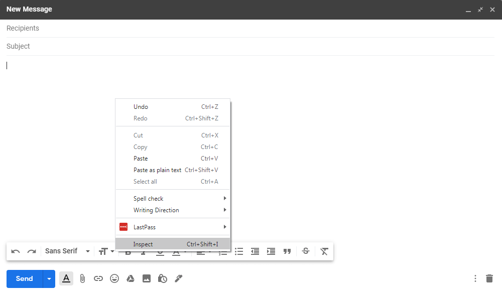
1. Open your Gmail client.
2. Click the “Compose” button.
3. Click with the right mouse button on the empty field. Choose the “Inspect option”:
4. You’ll see the DevTools window and this fragment of code:
<div id=":mh" class="Am Al editable LW-avf tS-tW" hidefocus="true" aria-label="Message Body" g_editable="true" role="textbox" aria-multiline="true" contenteditable="true" tabindex="1" style="direction: ltr; min-height: 356px;" itacorner="6,7:1,1,0,0" spellcheck="false"><br></div>
5. Find a <br> element inside this <div>.
6. Click with the right mouse button on the <div> element and choose the “Edit as HTML” option:
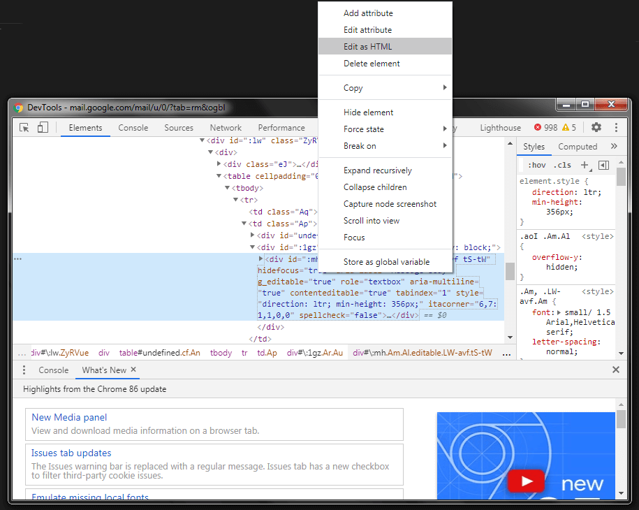
7. Delete the <br> element inside <div> and paste your entire HTML Email code there.
8. Close the DevTools window. Your HTML Email should be displayed in Gmail’s New Message window.
9. Test your HTML Email first by sending it to your own email address. If everything’s fine, send it to your subscribers.
Read also: